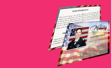
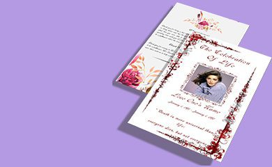
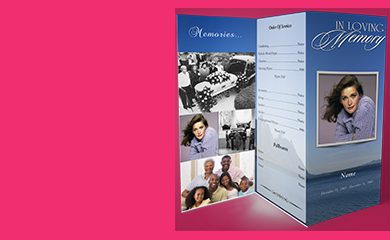
A funeral program front cover is often the first thing family and friends see—so it should feel like a thoughtful reflection of a loved one’s life, not a generic template. In this guide, you’ll learn personal, respectful ways to design a front cover, along with practical layout ideas, wording tips, and step-by-step guidance for getting it right.
What makes a funeral program front cover feel personal and respectful?
The best front covers balance clarity, warmth, and dignity. A personal touch doesn’t have to be loud—it can be as simple as the right photo, a meaningful line of scripture, or a theme that matches their story. Start by focusing on what the person valued, remembered, or represented.
- Meaningful imagery (a favorite photo, a flower, a symbol tied to their faith or hobbies)
- Clear, readable details (names, dates, service location)
- Warm, appropriate tone (comforting wording without overstatement)
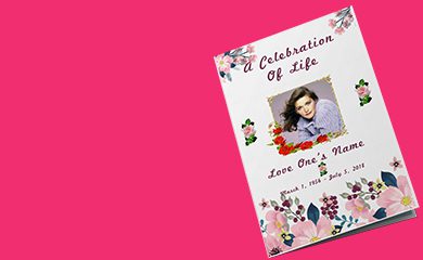
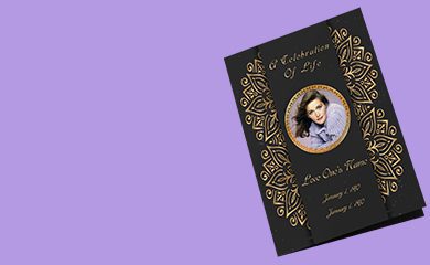
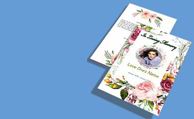
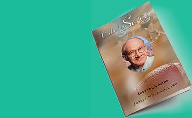
If you’re comparing options, you may find useful inspiration in funeral program front cover ideas that feel personal and respectful, especially when you’re deciding how to blend photo, text, and design style.
How to choose the right photo or symbol for the front cover
Visual elements can do a lot of emotional work—when they’re chosen thoughtfully. Whether you prefer a classic portrait or a subtle design element, aim for a cover that feels like them.
Photo selection tips that help
- Choose a photo with good lighting and clear facial features (if using a portrait).
- If you don’t want a full photo, consider a cropped headshot or a tasteful silhouette-style placement.
- For loved ones with a craft, career, or hobby, use a symbol or small icon (e.g., a tree, cross, book, musical note) instead of clutter.
Symbol ideas that can be gentle and meaningful
- Religious: cross, dove, olive branch, prayer hands (only if it fits the family’s beliefs)
- Seasonal: simple fall leaves, spring flowers, winter candles
- Life themes: waves for someone who loved the ocean, a trail for a hiking passion
Best ways to write front cover wording that honors without feeling heavy
Wording should be comforting, clear, and consistent with the tone of the service. The goal is to express respect while keeping the message easy to read from a distance.
Simple front cover lines that work well
- Name (full name or the name people used daily)
- Date range (birth–death years or full dates, depending on preference)
- One short phrase (e.g., “In Loving Memory,” “Forever in Our Hearts,” or a favorite quote)
How to include faith or scripture (when appropriate)
If you include a verse, keep it short and readable. Use a clean type style and avoid overly small fonts. If you’re unsure, consider asking the officiant or a family member for a preferred passage that feels authentic.
You can also use a gentle design approach described in funeral program front cover ideas to see how families structure titles, dates, and scripture so the layout remains calm and uncluttered.
How to layout the front cover for readability and a polished look
A funeral program cover should look composed even when printed. Strong layout choices help the design feel intentional and respectful.
Step-by-step layout approach
- Pick the focal point: a centered photo, or a subtle background image with text overlay.
- Set a clear hierarchy: name first, then dates, then the short tribute phrase.
- Leave breathing room: avoid cramming too many lines—white space keeps it elegant.
- Use consistent alignment: center align for a classic look or left align for a modern feel.
- Proof for print: check font size and contrast before finalizing.
Design details that make a difference
- Font pairing: choose one readable headline font and one simple body font.
- Color restraint: use one accent color that matches the photo theme (avoid many bright colors).
- Borders and frames: a thin border or soft corner lines can feel dignified.
What are respectful funeral front cover theme ideas?
Themes help unify the cover with the rest of the program. The best theme idea is one that mirrors the person’s life—without turning the design into a “party” or turning memories into caricature.
Theme ideas with a respectful feel
- Classic and timeless: portrait on a neutral background, elegant lettering, minimal icons.
- Nature-inspired: flowers, leaves, or landscapes paired with a short tribute line.
- Faith-forward: scripture wording, candle or dove imagery, and subdued colors.
- Personal story: a small symbol tied to a hobby (gardening, music, fishing) plus a photo.
How to avoid common front cover mistakes
Even with good intentions, a few missteps can make the cover feel less respectful. Use these checks before you finalize.
- Avoid too much text—the front cover should be calm and readable.
- Avoid overly busy graphics that compete with the photo and name.
- Avoid jarring color contrasts that reduce readability.
- Double-check spelling and date accuracy—it matters deeply.
Who should review the front cover before printing?
When you’re designing a funeral program, it helps to get a quick second set of eyes. Someone close can confirm tone, wording, and whether the image or symbols truly fit.
- Ask one family member for tone feedback: does it feel respectful?
- Ask one detail-focused person to proof names, dates, and service location.
- If faith is included, ask the officiant or a family representative to confirm scripture choice.
Ultimately, the most meaningful funeral program front cover ideas are the ones that reflect your loved one’s identity—through a thoughtful photo, gentle wording, and a clean, readable layout. Use the steps above to create a cover that feels personal, respectful, and unmistakably “them.”
{
“FAQPage”: {
“mainEntity”: [
{
“question”: “What makes a funeral program front cover feel personal and respectful?”,
“answer”: “The best front covers balance meaningful imagery, clear readable details (names and dates), and a warm, dignified tone that matches the loved one’s life and beliefs.”
},
{
“question”: “How to choose the right photo or symbol for the front cover?”,
“answer”: “Choose a photo with clear lighting and features (or a tasteful crop), or use subtle symbols tied to faith or hobbies. Aim for visuals that feel like the person without adding clutter.”
},
{
“question”: “How to layout the front cover for readability and a polished look?”,
“answer”: “Use a step-by-step layout: choose a focal point, set a clear text hierarchy (name first, then dates, then a short tribute line), leave breathing room, keep alignment consistent, and proof contrast and font sizes for print.”
}
]
}
}