

Funeral Program Font: Choosing the Right Typeface for a Lasting Tribute
Choosing the right font for a funeral program is a crucial decision. The font sets the tone for the entire program and can convey a sense of solemnity, elegance, or warmth. In this guide, we’ll explore the importance of selecting the right font for a funeral program and provide some tips for choosing the perfect typeface.
Importance of Font Selection
The font you choose for a funeral programs can significantly impact its overall look and feel. Here are some key reasons why font selection is important:
Readability: The primary purpose of a funeral program is to provide information about the deceased and the order of the service. A readable font is essential to ensure that the text is easy to read and understand.
Emotional Tone: Different fonts convey different emotional tones. For example, serif fonts are often associated with tradition and formality, while sans-serif fonts can feel more modern and approachable. The font you choose should reflect the tone you want to set for the program.
Aesthetic Appeal: The right font can enhance the overall aesthetic appeal of the program. A well-chosen font can complement other design elements and create a cohesive and visually appealing layout.
Personalization: The font you choose can also reflect the personality and preferences of the deceased. For example, if the deceased had a love for calligraphy, using a script font might be a fitting tribute.
Tips for Choosing the Right Font
When choosing a font for a funeral program, consider the following tips to ensure you make the right choice:
- Consider the Audience: Think about the preferences and expectations of the audience who will be attending the funeral. A font that is too ornate or difficult to read may not be suitable for all audiences.
- Match the Tone: Select a font that matches the tone of the program. For a formal and traditional service, a serif font might be appropriate, while a more casual or modern service might call for a sans-serif font.
- Focus on Readability: Above all, prioritize readability. Avoid overly decorative or elaborate fonts that may be difficult to read, especially for older attendees.
- Use Contrast: Ensure that there is enough contrast between the font color and the background color to ensure readability. Avoid using light-colored text on a light background or dark-colored text on a dark background.
- Limit the Number of Fonts: Stick to one or two fonts for the entire program to maintain a cohesive look. Using too many fonts can make the program look cluttered and unprofessional.
- Consider the Printing Process: If you plan to print the program, consider the printing process and choose a font that will reproduce well in print. Some fonts may look great on screen but may not print well.
Popular Fonts for Funeral Programs
Several fonts are commonly used for funeral programs due to their readability and classic appeal. Some popular choices include:
Times New Roman
A classic serif font that is highly readable and formal, making it a popular choice for traditional funeral programs.
Arial
A clean and modern sans-serif font that is easy to read, making it a good choice for a more contemporary program design.
Georgia
Another serif font that is highly readable and works well for both printed and digital funeral programs.
Garamond
A classic serif font that has a timeless appeal and works well for conveying a sense of tradition and elegance.
Verdana
A highly readable sans-serif font, especially at smaller sizes, makes it a good choice for programs with a lot of text.
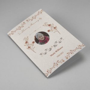
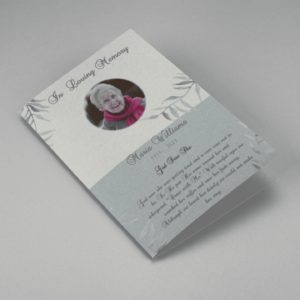
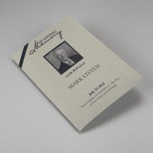
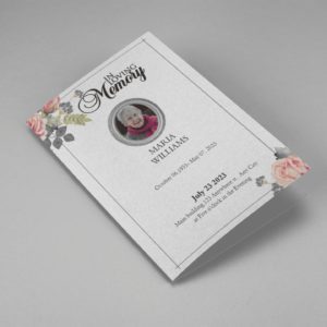
Funeral Templates
-
 Sale
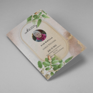
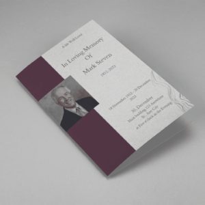
SaleSearching for a Oak Leaf With Gold Oval Frame Half Page Funeral Program that is easy to print and amass and has a cutting-edge look? The Oak Leaf With Gold Oval Frame Half Page Funeral Program is the Perfect decision because it measures 8.5”x 5.5”.
- No Limitation on Content, Edit anything
- Edit anytime – unlimited revisions even after purchased
- Get a printable PDF downloaded to get it printed on your own.
-
 Sale
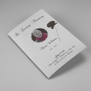
SaleSearching for a Brown and White Classic Funeral Program Half Page Program that is easy to print and amass and has a cutting-edge look? The Brown and White Classic Funeral Program Half Page Program is the Perfect decision because it measures 8.5”x 5.5”.
- No Limitation on Content, Edit anything
- Edit anytime – unlimited revisions even after purchased
- Get a printable PDF downloaded to get it printed on your own.
-
 Sale
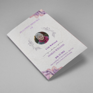
SaleSearching for a Purple Elegant Watercolor Half Page Funeral Program Template that is easy to print and amass and has a cutting-edge look? The Purple Elegant Watercolor Half Page Funeral Program Template is the Perfect decision because it measures 8.5”x 5.5”.
- No Limitation on Content, Edit anything
- Edit anytime – unlimited revisions even after purchased
- Get a printable PDF downloaded to get it printed on your own.
-
 Sale
SaleSearching for a Cream and Green Photo Obituary Half Page Program that is easy to print and amass and has a cutting-edge look? The Cream and Green Photo Obituary Half Page Program is the Perfect decision because it measures 8.5”x 5.5”.
- No Limitation on Content, Edit anything
- Edit anytime – unlimited revisions even after purchased
- Get a printable PDF downloaded to get it printed on your own.
-
 Sale
SaleSearching for a Cream Simple Elegant Photo Church Half Page Program that is easy to print and amass and has a cutting-edge look? The Cream Simple Elegant Photo Church Half Page Program is the Perfect decision because it measures 8.5”x 5.5”.
- No Limitation on Content, Edit anything
- Edit anytime – unlimited revisions even after purchased
- Get a printable PDF downloaded to get it printed on your own.
-
 Sale
SaleSearching for a Samovar Silver Half Page Funeral Program Template that is easy to print and amass and has a cutting-edge look? The Samovar Silver Half Page Funeral Program Template is the Perfect decision because it measures 8.5”x 5.5”.
- No Limitation on Content, Edit anything
- Edit anytime – unlimited revisions even after purchased
- Get a printable PDF downloaded to get it printed on your own.
-
 Sale
SaleSearching for an Elegant Beige Half Page Funeral Program Template that is easy to print and amass and has a cutting-edge look? The Elegant Beige Half-Page Funeral Program Template is the Perfect decision because it measures 8.5”x 5.5”.
- No Limitation on Content, Edit anything
- Edit anytime – unlimited revisions even after purchased
- Get a printable PDF downloaded to get it printed on your own.
-
 Sale
SaleSearching for a White Floral Pro Half Page Funeral Program Template that is easy to print and amass and has a cutting-edge look? White Floral Pro Half Page Funeral Program Template is the Perfect decision because it measures 8.5”x 5.5”.
- No Limitation on Content, Edit anything
- Edit anytime – unlimited revisions even after purchased
- Get a printable PDF downloaded to get it printed on your own.
-
 Sale
SaleSearching for a Grey and Burgundy Elegant Half Page Funeral Program Template that is easy to print and amass and has a cutting-edge look? Grey and Burgundy Elegant Half Page Funeral Program Template is the Perfect decision because it measures 8.5”x 5.5”.
- No Limitation on Content, Edit anything
- Edit anytime – unlimited revisions even after purchased
- Get a printable PDF downloaded to get it printed on your own.
-
 Sale
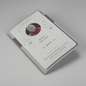
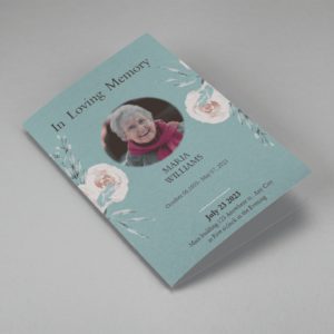
SaleSearching for a Soft Green and Grey Minimalist Floral Half Page Funeral Program Template that is easy to print and amass and has a cutting-edge look? Soft Green and Grey Minimalist Floral Half Page Funeral Program Template is the Perfect decision because it measures 8.5”x 5.5”.
- No Limitation on Content, Edit anything
- Edit anytime – unlimited revisions even after purchased
- Get a printable PDF downloaded to get it printed on your own.
-
 Sale
SaleSearching for a Gray Elegant Oval Frame Half Page Funeral Program Template that is easy to print and amass and has a cutting-edge look? Gray Elegant Oval Frame Half Page Funeral Program Template is the Perfect decision because it measures 8.5”x 5.5”.
- No Limitation on Content, Edit anything
- Edit anytime – unlimited revisions even after purchased
- Get a printable PDF downloaded to get it printed on your own.
-
 Sale
SaleSearching for a Blue Organic Minimal Half Page Funeral Program Template that is easy to print and amass and has a cutting-edge look? Blue Organic Minimal Half Page Funeral Program Template is the Perfect decision because it measures 8.5”x 5.5”.
- No Limitation on Content, Edit anything
- Edit anytime – unlimited revisions even after purchased
- Get a printable PDF downloaded to get it printed on your own.
-
 Sale
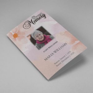
SaleSearching for a Pink and Orange Watercolour Half Page Funeral Program Template that is easy to print and amass and has a cutting-edge look? Pink and Orange Watercolour Half Page Funeral Program Template is the Perfect decision because it measures 8.5”x 5.5”.
- No Limitation on Content, Edit anything
- Edit anytime – unlimited revisions even after purchased
- Get a printable PDF downloaded to get it printed on your own.
-
 Sale
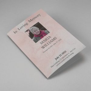
SaleSearching for a Pink Floral Paper Half Page Funeral Program Template that is easy to print and amass and has a cutting-edge look? Pink Floral Paper Half Page Funeral Program Template is the Perfect decision because it measures 8.5”x 5.5”.
- No Limitation on Content, Edit anything
- Edit anytime – unlimited revisions even after purchased
- Get a printable PDF downloaded to get it printed on your own.
Funeral Programs : Helping Videos
Frequently Asked Questions On Funeral Program Font
Why is the font selection important for a funeral program?
The font sets the tone for the program and can convey a sense of solemnity, elegance, or warmth. It also impacts readability, emotional tone, aesthetic appeal, and personalization.
How does font choice affect readability?
Fonts that are difficult to read can detract from the overall effectiveness of the program. Choosing a readable font ensures that the information is easy to understand for all attendees.
Are there specific fonts that are commonly used for funeral programs?
Yes, some popular fonts for funeral programs include Times New Roman, Arial, Georgia, Garamond, and Verdana. These fonts are chosen for their readability and classic appeal.
How many fonts should be used in a funeral program?
It is recommended to use one or two fonts for the entire program to maintain a cohesive look. Using too many fonts can make the program look cluttered and unprofessional.
What should be considered when selecting a font for a funeral program?
When selecting a font, consider the audience, tone of the program, readability, contrast with the background, printing process, and the personality of the deceased.