

Choosing the right fonts for funeral programs is a delicate yet crucial aspect of commemorating the life of a loved one. Fonts play a significant role in setting the tone, conveying emotions, and reflecting the personality of the deceased. In this comprehensive guide, we’ll explore the importance of selecting appropriate fonts for funeral programs and provide valuable insights to help you make informed decisions during this sensitive time.
Why Font Selection Matters
Fonts evoke emotions, convey messages, and create visual harmony. When designing a funeral program, the choice of fonts can profoundly impact how the information is perceived by mourners. Here’s why font selection matters:
Respectful Representation: The fonts used should reflect the dignity and solemnity of the occasion, honoring the memory of the departed with reverence.
Readability: Clear and legible fonts ensure that the information in the funeral program is easily accessible to attendees, allowing them to follow along seamlessly.
Personalization: Fonts can be a subtle yet powerful way to personalize the funeral program, reflecting the individuality and preferences of the deceased.
Emotional Connection: Certain fonts carry emotional connotations, evoking feelings of comfort, serenity, or nostalgia. Choosing fonts that resonate with the intended tone of the service can help create a meaningful connection with mourners.
Factors to Consider When Choosing Fonts
Selecting the right fonts for funeral program requires careful consideration of several factors:
Tone and Theme
Consider the overall tone and theme of the funeral service. Are you aiming for a traditional, formal atmosphere, or a more modern and uplifting vibe? Choose fonts that align with the intended mood.
Legibility
Prioritize legibility above all else. Opt for fonts that are easy to read, especially for older attendees or those with visual impairments.
Size and Hierarchy
Pay attention to font size and hierarchy to ensure that important information stands out appropriately. Use larger fonts for headings and titles, and smaller ones for body text.
Typeface Style
Different typeface styles convey distinct emotions and aesthetics. Serif fonts often exude elegance and formality, while sans-serif fonts offer a more contemporary and minimalist look.
Consistency
Maintain consistency in font choices throughout the funeral program to create a cohesive and polished appearance.
Popular Fonts for Funeral Programs
Several fonts are commonly used in funeral programs due to their readability and ability to convey a sense of reverence. Some popular choices include:
- Garamond: A classic serif font that is elegant and easy to read, making it suitable for longer passages of text.
- Calibri: A modern sans-serif font that is clean and easy to read, ideal for a more contemporary feel.
- Georgia: Another serif font that is highly readable, especially at smaller sizes, making it suitable for body text.
- Verdana: A sans-serif font that is highly legible even at small sizes, making it a good choice for body text or captions.
- Cambria: A serif font designed for readability, especially on screens, making it a good choice for digital funeral programs.
Funeral Program Templates
-
 Sale
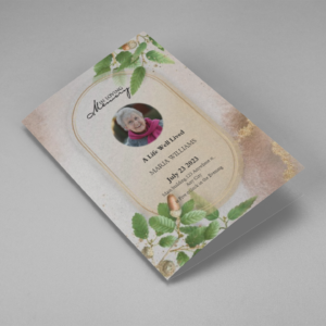
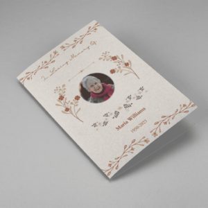
SaleSearching for a Oak Leaf With Gold Oval Frame Half Page Funeral Program that is easy to print and amass and has a cutting-edge look? The Oak Leaf With Gold Oval Frame Half Page Funeral Program is the Perfect decision because it measures 8.5”x 5.5”.
- No Limitation on Content, Edit anything
- Edit anytime – unlimited revisions even after purchased
- Get a printable PDF downloaded to get it printed on your own.
-
 Sale
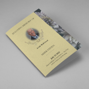
SaleSearching for a Brown and White Classic Funeral Program Half Page Program that is easy to print and amass and has a cutting-edge look? The Brown and White Classic Funeral Program Half Page Program is the Perfect decision because it measures 8.5”x 5.5”.
- No Limitation on Content, Edit anything
- Edit anytime – unlimited revisions even after purchased
- Get a printable PDF downloaded to get it printed on your own.
-
 Sale
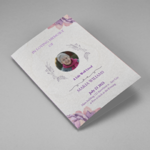
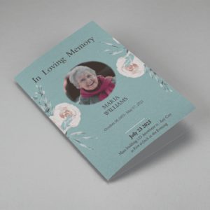
SaleSearching for a Purple Elegant Watercolor Half Page Funeral Program Template that is easy to print and amass and has a cutting-edge look? The Purple Elegant Watercolor Half Page Funeral Program Template is the Perfect decision because it measures 8.5”x 5.5”.
- No Limitation on Content, Edit anything
- Edit anytime – unlimited revisions even after purchased
- Get a printable PDF downloaded to get it printed on your own.
-
 Sale
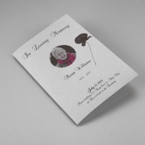
SaleSearching for a Cream and Green Photo Obituary Half Page Program that is easy to print and amass and has a cutting-edge look? The Cream and Green Photo Obituary Half Page Program is the Perfect decision because it measures 8.5”x 5.5”.
- No Limitation on Content, Edit anything
- Edit anytime – unlimited revisions even after purchased
- Get a printable PDF downloaded to get it printed on your own.
-
 Sale
SaleSearching for a Cream Simple Elegant Photo Church Half Page Program that is easy to print and amass and has a cutting-edge look? The Cream Simple Elegant Photo Church Half Page Program is the Perfect decision because it measures 8.5”x 5.5”.
- No Limitation on Content, Edit anything
- Edit anytime – unlimited revisions even after purchased
- Get a printable PDF downloaded to get it printed on your own.
-
 Sale
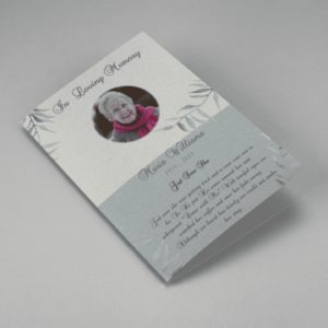
SaleSearching for a Samovar Silver Half Page Funeral Program Template that is easy to print and amass and has a cutting-edge look? The Samovar Silver Half Page Funeral Program Template is the Perfect decision because it measures 8.5”x 5.5”.
- No Limitation on Content, Edit anything
- Edit anytime – unlimited revisions even after purchased
- Get a printable PDF downloaded to get it printed on your own.
-
 Sale
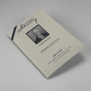
SaleSearching for an Elegant Beige Half Page Funeral Program Template that is easy to print and amass and has a cutting-edge look? The Elegant Beige Half-Page Funeral Program Template is the Perfect decision because it measures 8.5”x 5.5”.
- No Limitation on Content, Edit anything
- Edit anytime – unlimited revisions even after purchased
- Get a printable PDF downloaded to get it printed on your own.
-
 Sale
SaleSearching for a White Floral Pro Half Page Funeral Program Template that is easy to print and amass and has a cutting-edge look? White Floral Pro Half Page Funeral Program Template is the Perfect decision because it measures 8.5”x 5.5”.
- No Limitation on Content, Edit anything
- Edit anytime – unlimited revisions even after purchased
- Get a printable PDF downloaded to get it printed on your own.
-
 Sale
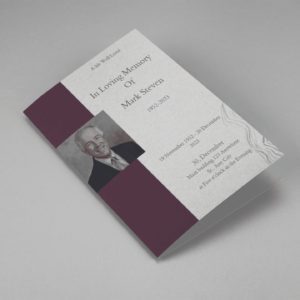
SaleSearching for a Grey and Burgundy Elegant Half Page Funeral Program Template that is easy to print and amass and has a cutting-edge look? Grey and Burgundy Elegant Half Page Funeral Program Template is the Perfect decision because it measures 8.5”x 5.5”.
- No Limitation on Content, Edit anything
- Edit anytime – unlimited revisions even after purchased
- Get a printable PDF downloaded to get it printed on your own.
-
 Sale
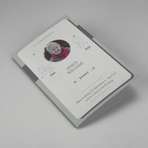
SaleSearching for a Soft Green and Grey Minimalist Floral Half Page Funeral Program Template that is easy to print and amass and has a cutting-edge look? Soft Green and Grey Minimalist Floral Half Page Funeral Program Template is the Perfect decision because it measures 8.5”x 5.5”.
- No Limitation on Content, Edit anything
- Edit anytime – unlimited revisions even after purchased
- Get a printable PDF downloaded to get it printed on your own.
-
 Sale
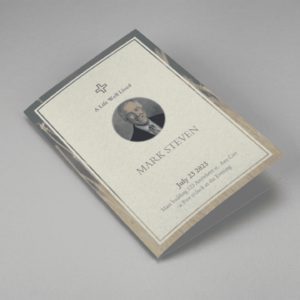
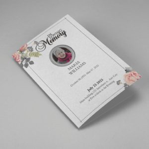
SaleSearching for a Gray Elegant Oval Frame Half Page Funeral Program Template that is easy to print and amass and has a cutting-edge look? Gray Elegant Oval Frame Half Page Funeral Program Template is the Perfect decision because it measures 8.5”x 5.5”.
- No Limitation on Content, Edit anything
- Edit anytime – unlimited revisions even after purchased
- Get a printable PDF downloaded to get it printed on your own.
-
 Sale
SaleSearching for a Blue Organic Minimal Half Page Funeral Program Template that is easy to print and amass and has a cutting-edge look? Blue Organic Minimal Half Page Funeral Program Template is the Perfect decision because it measures 8.5”x 5.5”.
- No Limitation on Content, Edit anything
- Edit anytime – unlimited revisions even after purchased
- Get a printable PDF downloaded to get it printed on your own.
-
 Sale
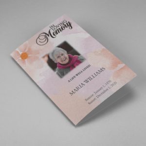
SaleSearching for a Pink and Orange Watercolour Half Page Funeral Program Template that is easy to print and amass and has a cutting-edge look? Pink and Orange Watercolour Half Page Funeral Program Template is the Perfect decision because it measures 8.5”x 5.5”.
- No Limitation on Content, Edit anything
- Edit anytime – unlimited revisions even after purchased
- Get a printable PDF downloaded to get it printed on your own.
-
 Sale
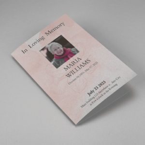
SaleSearching for a Pink Floral Paper Half Page Funeral Program Template that is easy to print and amass and has a cutting-edge look? Pink Floral Paper Half Page Funeral Program Template is the Perfect decision because it measures 8.5”x 5.5”.
- No Limitation on Content, Edit anything
- Edit anytime – unlimited revisions even after purchased
- Get a printable PDF downloaded to get it printed on your own.