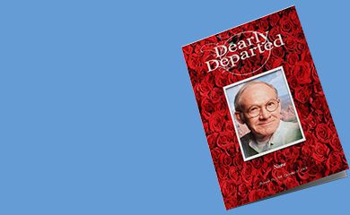
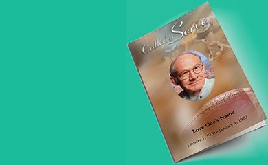
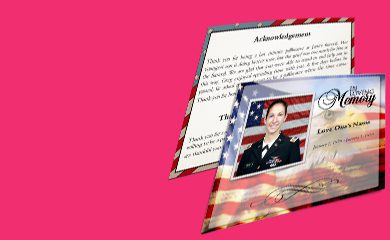
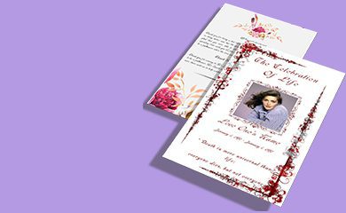
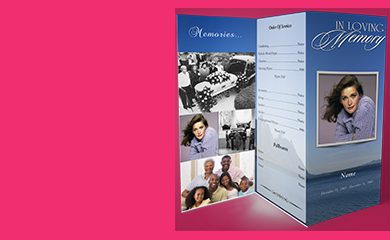
Choosing the right funeral program paper can feel surprisingly personal. After all, the paper you select sets the tone for the service—whether you want a soft, timeless look or a crisp, photo-friendly finish. In this guide, you’ll learn the real differences between glossy vs matte funeral program paper, what each finish does best, and how to decide which one fits your service needs and budget without guesswork.
What is glossy vs matte funeral program paper?
Before you compare options, it helps to know what you’re choosing. In plain terms, glossy paper has a shiny coating that reflects light, while matte paper has a non-reflective, smoother surface that absorbs light.
Both are commonly used for funeral programs, obituary inserts, and service booklets, but the look and readability can change based on your design and how the programs will be displayed.
How do glossy and matte finishes affect appearance?
The finish you pick influences everything from photo clarity to how text looks under indoor lighting. Here’s what to expect.
Glossy paper: what it does best
- Vibrant photo reproduction: Glossy finishes often make color images look more vivid.
- Sharper “pop”: Logos, decorative borders, and emphasized headings can stand out more.
- More light reflection: Strong overhead lighting can create glare for some viewers.
Matte paper: what it does best
- Low glare readability: Matte reduces shine, helping text remain comfortable to read.
- Soft, timeless look: Many families prefer the calm, understated feel of matte.
- Elegant with monochrome designs: Matte often looks especially tasteful with black-and-white layouts.
Which one should you choose for funeral program photos?
If your program includes portraits, memorial images, or color graphics, this is often the deciding factor. The best approach is to match the finish to the content you’re printing.
Choose glossy if your layout is photo-forward
Consider glossy when the program features color photos or when your design includes multiple images that you want to look vivid and crisp.
Choose matte if your layout is text-forward
Consider matte when the program primarily includes service details (order of service, readings, acknowledgments) or when the design is intentionally minimal.
Best ways to decide between glossy and matte for your specific service
If you’re trying to choose quickly and confidently, use this simple checklist.
Step-by-step decision process
- Look at your design mix: More photos and color? Lean glossy. More text and scripture? Lean matte.
- Think about lighting: If your venue has strong overhead lights, matte can reduce glare.
- Consider the emotional tone: Glossy often feels more polished and vibrant, while matte feels softer and more timeless.
- Check viewing distance: If programs are handed out and viewed up close, glossy can still work well. For groups viewing under bright lights, matte is safer.
- Review any special elements: Foil effects, high-contrast artwork, or detailed graphics may benefit from glossy’s punch.
How to test the finish before you print
If you’re unsure, you don’t have to rely on guesswork. A proof or sample can save you from reprints.
- Request a physical sample: Seeing the paper in natural and indoor light makes the choice much clearer.
- Review with your actual artwork: Photos, gradients, and dark backgrounds can behave differently on each finish.
- Check readability at a glance: If you’re viewing text from a typical reading distance, choose the finish that stays comfortable.
If you want a deeper look at how the two finishes compare, you can learn more about Glossy vs Matte Funeral Program Paper Which One Fits Your Service and use those considerations as you finalize your booklet plan.
Best paper weight and finish pairing tips
Finish matters, but so does thickness. Even with the same finish, the overall feel can change depending on paper weight.
- For a more substantial feel: Match a slightly heavier weight with either finish for a premium, booklet-like impression.
- For delicate designs: If your program uses light colors or fine text, matte can help prevent distracting reflections.
- For photo-heavy layouts: Glossy with a durable weight can help maintain a crisp, “printed photo” effect.
Common questions about glossy vs matte funeral program paper
Will glossy paper be too shiny in a church or chapel?
It can be, depending on lighting. If your venue has bright spotlights or strong reflections, matte funeral program paper may be the safer choice for comfortable reading.
Does matte make photos look dull?
Matte can mute contrast compared to glossy, but it still looks great—especially for soft, traditional portraits. If your photos are a key part of the tribute, consider glossy for more vivid color and detail.
What’s the simplest way to match the finish to the design?
Use the “content first” rule: photos and color generally lean glossy, while text and readability generally lean matte. If you want, you can also cross-check your decision while comparing glossy vs matte funeral program paper to ensure your choice fits the overall service style.
Summary: glossy or matte—what’s the best fit?
The right funeral program paper finish comes down to how you want the service to feel and what your design includes. Choose glossy when photos and color need extra vibrance, and choose matte when you want low glare, calm readability, and a timeless presentation. Use the checklist above to match your finish to your venue and layout, and you’ll end up with programs that look polished and feel right.
{
“@context”: “https://schema.org”,
“@type”: “FAQPage”,
“mainEntity”: [
{
“@type”: “Question”,
“name”: “What is glossy vs matte funeral program paper?”,
“acceptedAnswer”: {
“@type”: “Answer”,
“text”: “Glossy paper has a shiny coating that reflects light, while matte paper has a non-reflective surface that absorbs light. Both are used for funeral programs, but the finish changes how photos, text, and decorations appear under different lighting.”
}
},
{
“@type”: “Question”,
“name”: “Which one should you choose for funeral program photos?”,
“acceptedAnswer”: {
“@type”: “Answer”,
“text”: “Choose glossy when your program is photo-forward with color portraits or graphics you want to look vivid and crisp. Choose matte when your program is more text-forward, with service details and readings, or when you want softer, low-glare viewing.”
}
},
{
“@type”: “Question”,
“name”: “Will glossy paper be too shiny in a church or chapel?”,
“acceptedAnswer”: {
“@type”: “Answer”,
“text”: “It can be, depending on venue lighting. If the chapel has bright spotlights or strong reflections, matte is often the safer option because it reduces glare and helps keep text comfortable to read.”
}
}
]
}