

Fonts for Funerals: Choosing the Right Typeface to Honor Loved Ones
When it comes to funeral programs, every detail matters. From the choice of words to the layout and design, every element contributes to creating a meaningful tribute to the departed. One often overlooked aspect of funeral programs design is the font. While it may seem like a small detail, the typeface you choose can have a significant impact on the overall look and feel of the program.
Why Fonts Matter in Funeral Programs
Fonts play a crucial role in setting the tone and conveying the message of a funeral program. They can evoke emotions, convey a sense of tradition or modernity, and reflect the personality of the deceased. Here are some key reasons why fonts matter in funeral programs:
- Readability: The primary purpose of a funeral program is to provide information about the service and the deceased. Therefore, it’s essential to choose a font that is easy to read, especially for older guests.
- Emotional Impact: Fonts can evoke different emotions. For example, a script font might convey a sense of elegance and formality, while a sans-serif font might feel more modern and approachable.
- Reflecting the Deceased: The font you choose can also reflect the personality and style of the deceased. For example, if the deceased was known for their elegance and sophistication, a classic serif font might be appropriate.
- Consistency: Using consistent fonts throughout the program helps create a cohesive and professional-looking design.
Tips for Choosing the Right Font
When choosing a font for a funeral program, consider the following tips to ensure you make the right choice:
- Readability: Choose a font that is easy to read, especially at smaller sizes. Avoid overly decorative fonts that may be difficult to decipher.
- Appropriateness: Consider the tone of the funeral program and choose a font that complements it. For example, a formal funeral may call for a more traditional font, while a celebration of life may be better suited to a more casual font.
- Consistency: Use no more than two or three fonts throughout the program to maintain a cohesive look. Use one font for headings and another for body text for clarity.
- Size and Weight: Ensure that the font size and weight are appropriate for the layout and design of the program. Headings should be larger and bolder, while body text should be smaller and lighter.
- Testimonials: Consider using testimonials from the deceased’s loved ones in the program. Use a distinct font or style to set them apart from the rest of the text.
Popular Fonts for Funeral Programs
While the choice of font ultimately depends on personal preference and the specific requirements of the program, here are some popular fonts that are often used in funeral programs:
- Times New Roman: A classic serif font that is easy to read and has a formal feel.
- Arial: A simple sans-serif font that is clean and modern, ideal for a more contemporary look.
- Cambria: Another serif font that is easy to read and has a timeless quality.
- Garamond: A classic serif font with a slightly more elegant and refined look.
- Verdana: A clean and simple sans-serif font that is easy to read, especially at smaller sizes.
Funeral Templates
-
 Sale
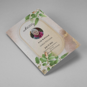
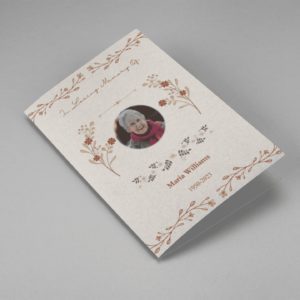
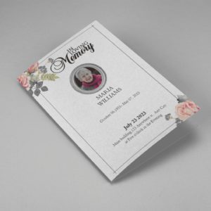
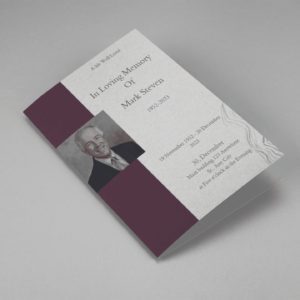
SaleSearching for a Oak Leaf With Gold Oval Frame Half Page Funeral Program that is easy to print and amass and has a cutting-edge look? The Oak Leaf With Gold Oval Frame Half Page Funeral Program is the Perfect decision because it measures 8.5”x 5.5”.
- No Limitation on Content, Edit anything
- Edit anytime – unlimited revisions even after purchased
- Get a printable PDF downloaded to get it printed on your own.
-
 Sale
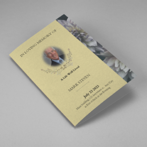
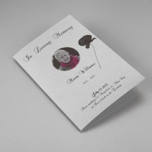
SaleSearching for a Brown and White Classic Funeral Program Half Page Program that is easy to print and amass and has a cutting-edge look? The Brown and White Classic Funeral Program Half Page Program is the Perfect decision because it measures 8.5”x 5.5”.
- No Limitation on Content, Edit anything
- Edit anytime – unlimited revisions even after purchased
- Get a printable PDF downloaded to get it printed on your own.
-
 Sale
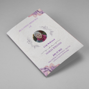
SaleSearching for a Purple Elegant Watercolor Half Page Funeral Program Template that is easy to print and amass and has a cutting-edge look? The Purple Elegant Watercolor Half Page Funeral Program Template is the Perfect decision because it measures 8.5”x 5.5”.
- No Limitation on Content, Edit anything
- Edit anytime – unlimited revisions even after purchased
- Get a printable PDF downloaded to get it printed on your own.
-
 Sale
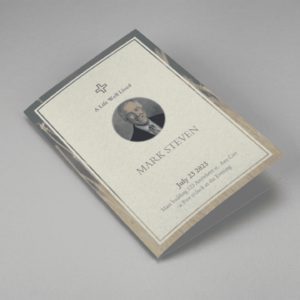
SaleSearching for a Cream and Green Photo Obituary Half Page Program that is easy to print and amass and has a cutting-edge look? The Cream and Green Photo Obituary Half Page Program is the Perfect decision because it measures 8.5”x 5.5”.
- No Limitation on Content, Edit anything
- Edit anytime – unlimited revisions even after purchased
- Get a printable PDF downloaded to get it printed on your own.
-
 Sale
SaleSearching for a Cream Simple Elegant Photo Church Half Page Program that is easy to print and amass and has a cutting-edge look? The Cream Simple Elegant Photo Church Half Page Program is the Perfect decision because it measures 8.5”x 5.5”.
- No Limitation on Content, Edit anything
- Edit anytime – unlimited revisions even after purchased
- Get a printable PDF downloaded to get it printed on your own.
-
 Sale
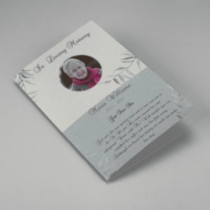
SaleSearching for a Samovar Silver Half Page Funeral Program Template that is easy to print and amass and has a cutting-edge look? The Samovar Silver Half Page Funeral Program Template is the Perfect decision because it measures 8.5”x 5.5”.
- No Limitation on Content, Edit anything
- Edit anytime – unlimited revisions even after purchased
- Get a printable PDF downloaded to get it printed on your own.
-
 Sale
SaleSearching for an Elegant Beige Half Page Funeral Program Template that is easy to print and amass and has a cutting-edge look? The Elegant Beige Half-Page Funeral Program Template is the Perfect decision because it measures 8.5”x 5.5”.
- No Limitation on Content, Edit anything
- Edit anytime – unlimited revisions even after purchased
- Get a printable PDF downloaded to get it printed on your own.
-
 Sale
SaleSearching for a White Floral Pro Half Page Funeral Program Template that is easy to print and amass and has a cutting-edge look? White Floral Pro Half Page Funeral Program Template is the Perfect decision because it measures 8.5”x 5.5”.
- No Limitation on Content, Edit anything
- Edit anytime – unlimited revisions even after purchased
- Get a printable PDF downloaded to get it printed on your own.
-
 Sale
SaleSearching for a Grey and Burgundy Elegant Half Page Funeral Program Template that is easy to print and amass and has a cutting-edge look? Grey and Burgundy Elegant Half Page Funeral Program Template is the Perfect decision because it measures 8.5”x 5.5”.
- No Limitation on Content, Edit anything
- Edit anytime – unlimited revisions even after purchased
- Get a printable PDF downloaded to get it printed on your own.
-
 Sale
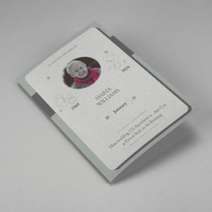
SaleSearching for a Soft Green and Grey Minimalist Floral Half Page Funeral Program Template that is easy to print and amass and has a cutting-edge look? Soft Green and Grey Minimalist Floral Half Page Funeral Program Template is the Perfect decision because it measures 8.5”x 5.5”.
- No Limitation on Content, Edit anything
- Edit anytime – unlimited revisions even after purchased
- Get a printable PDF downloaded to get it printed on your own.
-
 Sale
SaleSearching for a Gray Elegant Oval Frame Half Page Funeral Program Template that is easy to print and amass and has a cutting-edge look? Gray Elegant Oval Frame Half Page Funeral Program Template is the Perfect decision because it measures 8.5”x 5.5”.
- No Limitation on Content, Edit anything
- Edit anytime – unlimited revisions even after purchased
- Get a printable PDF downloaded to get it printed on your own.
-
 Sale
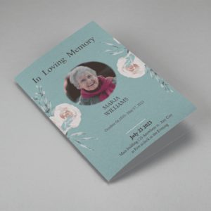
SaleSearching for a Blue Organic Minimal Half Page Funeral Program Template that is easy to print and amass and has a cutting-edge look? Blue Organic Minimal Half Page Funeral Program Template is the Perfect decision because it measures 8.5”x 5.5”.
- No Limitation on Content, Edit anything
- Edit anytime – unlimited revisions even after purchased
- Get a printable PDF downloaded to get it printed on your own.
-
 Sale
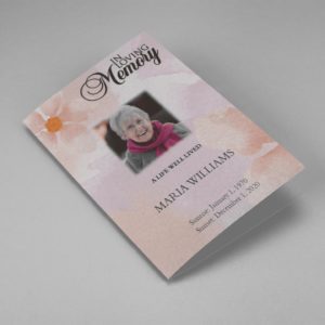
SaleSearching for a Pink and Orange Watercolour Half Page Funeral Program Template that is easy to print and amass and has a cutting-edge look? Pink and Orange Watercolour Half Page Funeral Program Template is the Perfect decision because it measures 8.5”x 5.5”.
- No Limitation on Content, Edit anything
- Edit anytime – unlimited revisions even after purchased
- Get a printable PDF downloaded to get it printed on your own.
-
 Sale
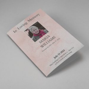
SaleSearching for a Pink Floral Paper Half Page Funeral Program Template that is easy to print and amass and has a cutting-edge look? Pink Floral Paper Half Page Funeral Program Template is the Perfect decision because it measures 8.5”x 5.5”.
- No Limitation on Content, Edit anything
- Edit anytime – unlimited revisions even after purchased
- Get a printable PDF downloaded to get it printed on your own.
Funeral Program s: Helping Videos
Frequently Asked Questions On Font For Funeral
Why is the choice of font important in a funeral program?
The choice of font can significantly impact the overall look and feel of a funeral program. Fonts can convey emotions, reflect the personality of the deceased, and contribute to the program’s readability and visual appeal.
What are some popular fonts used in funeral programs?
Some popular fonts used in funeral programs include Times New Roman, Arial, Cambria, Garamond, and Verdana. These fonts are chosen for their readability, elegance, and timeless quality.
How many fonts should I use in a funeral program?
It is recommended to use no more than two or three fonts in a funeral program to maintain a cohesive look. Use one font for headings and another for body text for clarity.
How can I ensure the readability of the font in a funeral program?
To ensure readability, choose a font that is easy to read, especially at smaller sizes. Avoid overly decorative fonts that may be difficult to decipher. Additionally, consider the contrast between the font color and the background color to ensure readability.